guy.pyrzak

Bugzilla, YUI, and other things.

Saturday, August 11, 2012

Where has Guy been?

For those who have wondered where I've been for the past 2 years, I now have a bit of time to tell you. I've been working on the software that is used to operate the Curiosity rover on Mars! Don't know what Curiosity is? It's a 1 ton rover that NASA just landed on Mars, oh yeah, it's got a lazer!


Needless to say I'm pretty excited. Over the next few months I'm going to be working on the mission as a Science Planner and working with the mission to help improve our software and make sure it's ready to be used for the full 2 years of the current mission and hopefully years into the future!

I've got a HUGE backlog of bugs from Bugzilla that I'm hoping to get to give some attention so hopefully I'll get a few weekends to work on those.

But I'm very excited to share this news with the rest of the Bugzilla community. Hopefully all of you will enjoy the beautiful images that get sent back from Mars as much as I have!

As I get more familiar and comfortable with my responsibilities on the mission, I'll spend some time publishing more information about MSLICE and how its used on the mission. If you'd like to learn more about MSLICE now, we made a 1 pager for landing and you can read it here:
http://hci.arc.nasa.gov/mslice.html

Friday, July 09, 2010

Prepare yourself for some changes people!

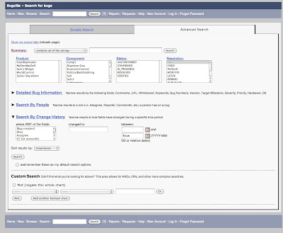
Bugzilla 4.0 has frozen and soon it will be released. There are a bunch of exciting changes that you can expect which I will try to highlight over the next few posts. The big ones that I'm sure will get a lot of attention, for better or worse, are:
  • the autocompletes for user fields and keywords
  • redesigned advanced search page
  • the redesigned attachments page.
  • create page validation
We've also got a patch in the works that will redo the homepage and make it much prettier and professional looking thanks to Jon Pink. You can also look forward to that in 4.0!

I've attached images of the 3 new pages which will hopefully encourage you all to play around with landfill!


As always we'd love to hear your feedback about this and the other changes that are coming in 4.0 (there are a lot of them, jsonp, better extension support, new default workflow, more webservices... it's a long list).

Monday, March 15, 2010

YUI and the recordvalueupdateevent event!

This weekend I had a fairly basic task. I had 2 tables with checkboxes that were populated with data and 1 widget that was supposed to listen to changes in the tables.

I could have just wired my widget into the checkboxes, but that didn't seem like the correct way to do it. Instead I decided to wire the widget into the data model. But the thing that really ended up getting me is to use the recordvalueupdateevent, which is basically the only way to listen to updates in a record set requires 2 things.

1. you have to use this.getRecordSet().updateRecordValue()
2. you have to create the event! .getRecordSet().createEvent('recordValueUpdateEvent');

If you don't do these 2 things you won't be able to get this to work

Below are the two ways i could have done it. Actual code to come in the future.

My hope is someone else who gets stuck with this will be able to find it.
Thanks to http://mart.kiev.ua/yui-recordset-events who wrote about this in Russian or some other slovic language which google helpfully translated to English!

Tuesday, March 09, 2010

ideas for User stats to gether for more human bugzilla v0

Statistics to show about a user

All things in list with & in the bullet might have a "veteran" and "newbie" designation.

Newbie and Veteran status can be determined either by a count or time.
-- If it is a count then it would simply be an above a line and below a line
-- If it is a time it would be before X date for veterans and newbie would be determined by N duration before today.
-- We might want to allow users to configure these settings and let them use one or both systems.
-- V1 might just have a config file, V2 might have a table in the database or a param tab


* CC List
***& Num bugs user is on CC list

* QA Field
***& Num bugs user is QA on

* Comments
***& Num
*** Recent Activity ( num bugs in the past N duration )

* Bug Fixing
***& Assigned
*** Assigned and Fixed
*** Recent Activity ( num where status was changed to fixed in N duration )

* Bug Patches
***& Num patches created
*** Num patches created with + flag
*** Recent Activity ( patches created in N duration )

* Bug Filing
***& Num bugs filed
*** Num bugs resolved as duplicates
*** Recent Activity

* Bug Reviewer
***& Num reviews per bug
*** Recent Activity ( Num bugs set to + or - in N duration )

* Bugs Verified
*** How do we do this???

What has the user filed bugs on?
-- With all these stats how do we determine what they have worked on?
-- Do a count per project for how many ANY of the above the user has done, if the number is more than N then that person has that project show up


Once the extension is installed we first need to do old stats gathering
After that we will rely on either a cron job OR hooks or both

We need to extend the user object and add these stats

Monday, March 08, 2010

Bugzilla Extensions: Gravatar and Inline Images

There are 2 bugs which I have been paying some attention to recently.

The first one is Bug 222861 which requests that images are displayed when they are mentioned in comments. This bug was important to me because I often found myself and others referring to images and attachments in comments and then having to open them up in a new window. I really wanted developers to just see the mocks i made along with my comments about them. It was determined that this bug makes more sense as an extension. So I wrote one. I've posted it here: http://github.com/pyrzak/Bugzilla-Extension--Inline-Images. Hopefully you guys like it!

The second one is Bug 395802 which requests to be able to support gravatar images. This is something Aza Raskin specifically mentioned by saying make it easier to know "who is this guy". Step 1 is adding a human face to a comment via the gravatar, Step 2 might be about grabbing their stats.

There were 2 mocks that I made as suggestions for how this should look. The first is:

Here is the other mock:

My hope is that we're finally to the point where many of Aza's and other's ideas might be possible thanks to the new extension system and the jsonp bug 550727. Both of which wouldn't be possible if mkanat didn't work so hard to add this kind of mash-up and extensibility, so thanks!

Any feedback about either of these extensions or anything else I mentioned is very welcomed.

Saturday, February 27, 2010

New Advanced Search UI V2

Here is the second version trying to take into account the suggestions given.

This UI would remember whatever is expanded and collapsed based on the user's cookies.

Another option that isn't displayed here is the column layout would change from 3 to X based on how wide the screen is (aka elastic).

I tried to increase the information density as well.

For saved/editable searches we might try to use the text description from the search UI.

Looking forward to hearing your feedback about the changes and improvements.

A new layout for the Attachments page

There were some comments today about the attachments page and how wonky it is. Bug 101770 has become the place where I've decided to post a response and possible solution to the problem but since I'm sure folks don't want to bother going to the bug here are the images that I posted. Let me know what you think. My hope is that we'll be able to implement this new UI quickly and make a big improvement without making anyone too upset about losing the current Attachments UI.


Things to note. The comments box and the attachment iframe would be elastic so they would grow with the width of the page. Clicking edit attachment as comment would cause the comment box to go away and the big area would turn into a comment.

My hope for this layout is to 1 give more realestate to the comment box that is equal to the area on the current bug page as well as make it easier for people editing the patches directly to have more room.

This UI also puts the focus where it belongs, on the attachment itself.

Things to note. I'm not at all happy with the placement of the patch and obsolete checkboxes. Any suggestions on where those should go is greatly appreciated.